

Most social posts don't get skipped because the offer is weak, they get skipped because the design gives the eye no reason to stay. I ran our whole team through a design refresher a couple of weeks back: ten design principles, exercises, no mercy. Grab your notepad kiddos, and take notes!
None of it requires a design degree because good design isn’t about making things pretty, it's about solving problems. And on social, the first problem is always attention.
It starts with layout, the grid that everything else lives inside. Before you place a single element, give the design structure, because the eye reads structure before it reads a single word, and a post without it registers as noise. Once you have a grid, you're distributing weight across it, and that's balance. Nothing should feel like it's tipping over unless you want it to, so use symmetry when you want stability and asymmetry when you want energy. A luxury piece wants symmetry, a launch announcement can afford a disruption.
From there, alignment decides how the eye moves. Snap related elements to a shared edge or center so the reader moves through them in order. My favorite real-world example is the McDonald's billboard that aligned the golden arches with the actual sun, alignment happening outside the design itself, and it's the whole reason the ad is memorable.

That's hierarchy, and it's the principle I'd protect above all the others. Decide the one thing you want seen first, then make size, weight, color, and placement all point at it, because if everything is loud, nothing is. One Chipotle billboard nailed this with a single line, "We wanted to write about our locally sourced natural ingredients, but sure, billboard headlines are better."
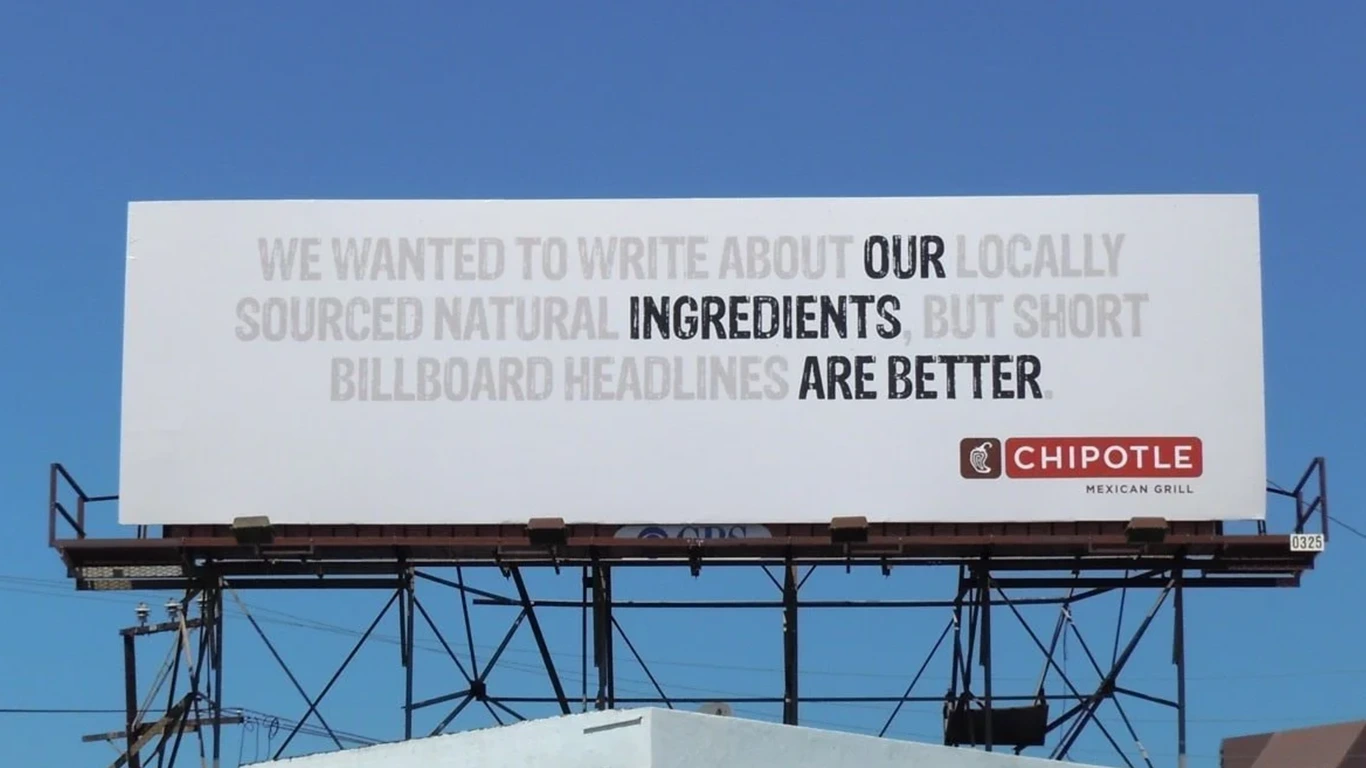
That's hierarchy with a sense of humor. Billboards should only have headlines with nine words or fewer so that your reader, who is passing at 60 miles an hour, can quickly read. And so, they utilized color hierarchy to get their message across.
Hierarchy only works if contrast backs it up. Make the important element different on purpose.
Then repetition turns single posts into a brand, because reusing the same colors, shapes, and typefaces builds pattern recognition, and pattern recognition is what makes a feed feel like one company instead of nine one-offs.
The last stretch is about feel. Rhythm is the beat your spacing creates, regular for order, varied for energy, and one outdoor ad literally used pedestrians walking past as the ticks on a dog, turning the street into the rhythm.
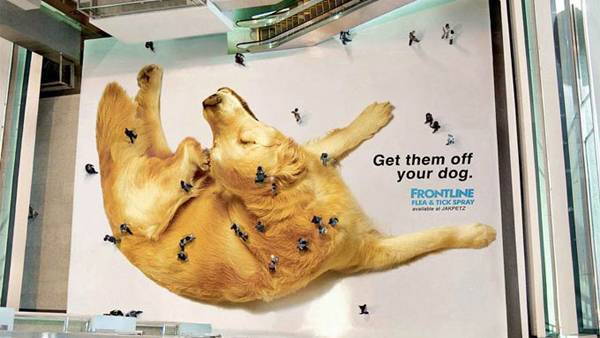
Proportion means bigger reads as more important, so size things accordingly.
White space is the breathing room, and before you add anything, ask whether removing something would help more, because adding is not always the answer.
And unity is the final check, step back and ask whether the piece reads as one idea or several ideas fighting, because if the other nine worked, this one answers itself.
Once you've got the ten principles down, color and fonts are where the personality comes in. They don't replace good design, they make good design work harder. Think of these as practical guidelines that help you make stronger choices, from where the eye goes first to how a brand feels before someone reads a single word.
Follow 60-30-10, 60% dominant color, 30% secondary, 10% accent used sparingly, and remember color talks before your copy does. Banks go blue because blue reads calm and trustworthy, McDonald's and Coke own red for urgency and appetite, No Frills owns yellow for pure attention, TD went green because green says your money is growing, and Crown Royal's purple bag has been saying luxury since before any of us could buy it. Whatever palette you pick, check the contrast between text and background, because a palette that looks great but fails legibility isn't doing its job.
Choose upto two or three fonts per design, never more. Pair by contrast, not similarity: one serif with one sans serif, and build hierarchy with weight and size before you even think about a third font. Then test everything at actual size, in the place it will actually live, because a graphic that sings on your desktop can die in a thumbnail.
Once you’ve mastered all these principles, you can break them and do the unexpected.
One great example of this is Silberman’s Fitness Center billboard. They broke balance to showcase what their audience might be experiencing aligned with their suggested solution.

The session was more than a presentation, it was an interactive experience. Every principle came with a 30-second drill: design something using just that principle (plus the shapes & assets given in Canva) before the timer runs out. Thirty seconds sounds brutal, but that's the point, it forces the decision instead of the deliberation.
Here's each principle, how it works, and what to do with it:
At the end, everyone rebuilt the same presentation cover using at least five principles in 5 mins. Same brief, same photo, same logo, and now that you know what each principle does, watch how differently they can be used:
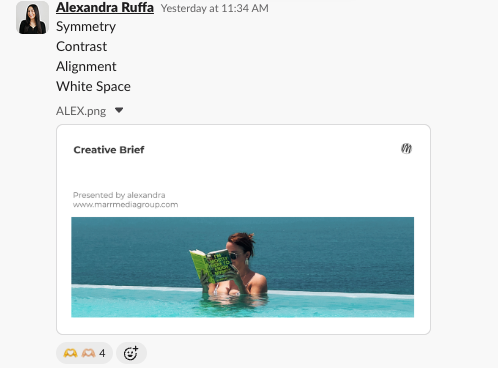
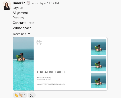


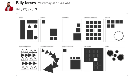


Thirty seconds per drill. If they can make these calls that fast, you can make them before your next post.
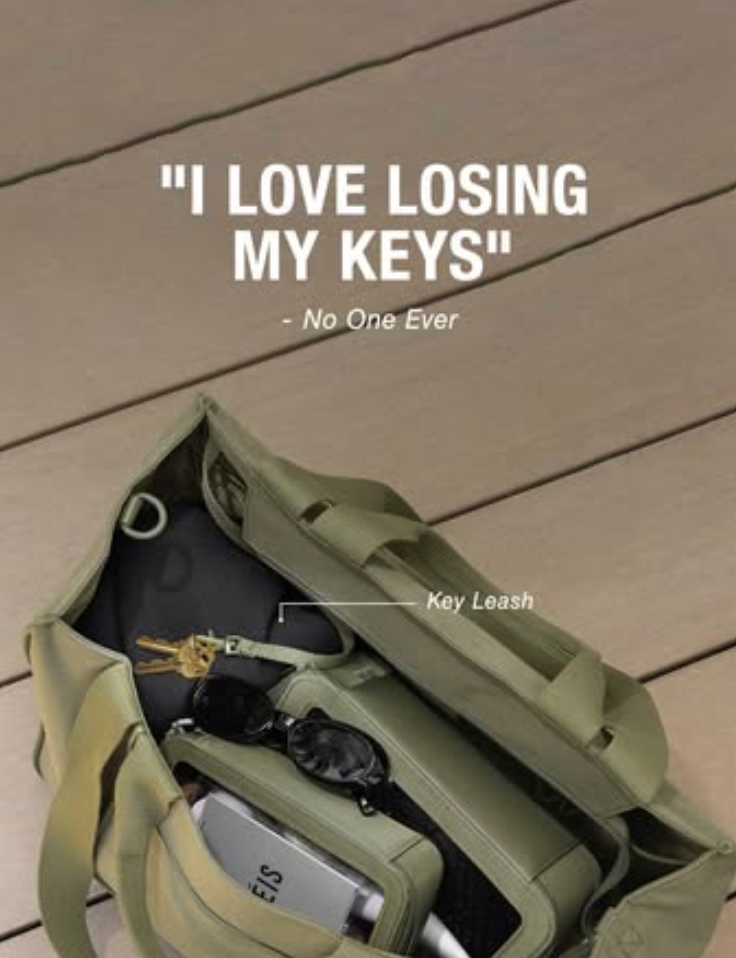
Contrast: the copy says the opposite of what anyone actually feels, then undercuts it with the truth. "I love losing my keys." "No one ever." That gap between the statement and the reality is the whole joke.

Repetition: "Work bag? Travel bag? Everyday bag? Same bag." Three setups, one word repeated on purpose, so it sticks the way a good line always does.
Both good design and good copy are solving the same problem: give the eye, or the ear, a reason to stay.
So here's my question to you: which of these principles are you applying on your socials right now? Run your last five posts through the checklist below and find out.
Now, it’s your turn to think about these design principles while you create your next post.
Related Articles
.webp)
This guide is a step-by-step blueprint for consumer product brands looking to turn their happiest customers into powerful brand affiliates. By leveraging social media, brands can create a cost-effective, high-converting affiliate program that generates organic word-of-mouth marketing.




.jpg)