
The ad our client thought was a mistake
One of our clients asked us to fix an ad they thought looked like a mistake. It ended up pulling a return on ad spend (ROAS) of over 42x, the highest-performing ad in their entire account, and one of the best ad returns we've seen across every account we run.
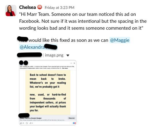
A few weeks back, our Creative Director, Casey, spotted a trend taking over feeds: “ugly” ads. Plain, text-heavy, a little rough, the kind of thing that looks like a note typed on a phone, not something an agency made. They break every design rule, and they are the ads people actually stop to read. So we ran one in a prospecting campaign, straight against our polished, on-brand creative, and let the data decide.
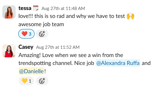
Taking that ugly design and running it as a straight creative test, we had our answer within two days, a ROAS north of 8x on cold traffic and climbing, the hardest audience there is, people who’ve never heard of the brand. So when the client spotted it out in the wild, flagged the uneven spacing and a stray comment, and asked us to tidy it up, we said no, because we already knew exactly what it was doing and weren’t about to fix something that wasn’t broken.
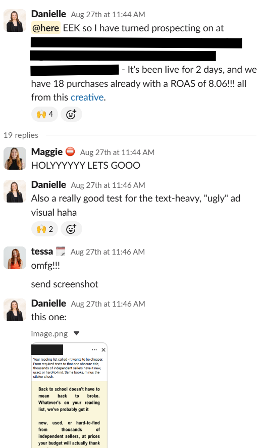
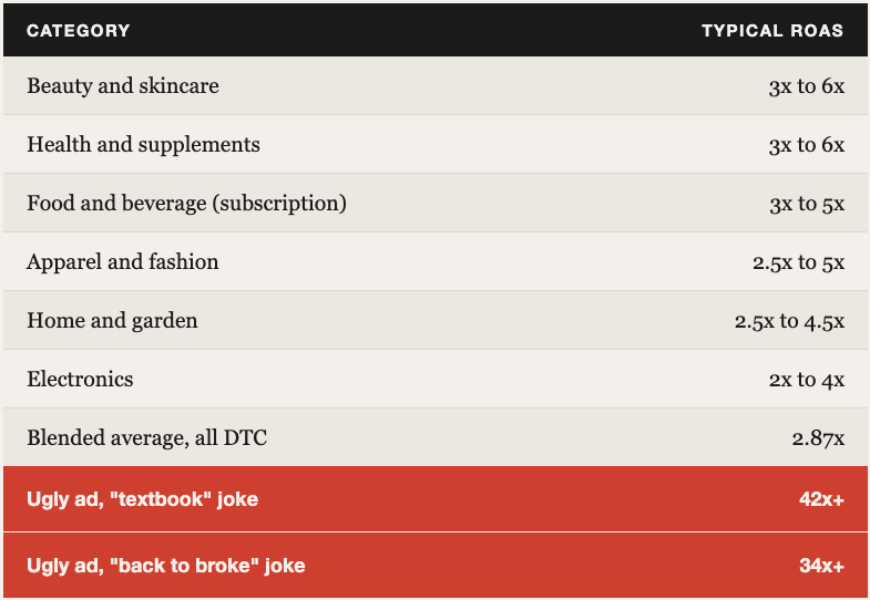
It worked so well we started running a few different flavours of ugly against each other, just to see how far this thing could go. One leans into a "only your professor knows" textbook joke and it's sitting north of 42x ROAS, another plays on being "back to broke" and it's right behind at over 34x, and neither one looks anything like a normal brand ad or shows any sign of slowing down.
For context, most DTC brands aren’t even coming close to that on Meta. See how the benchmarks compare, then take a look at where our ugly ads landed.
The lesson: your gut reaction to creative, and often your client’s too, rarely matches how it performs. The ad you’d frame on the wall and the ad that actually sells are usually two different ads. That’s why we test.
If everything in your account looks polished and on-brand right now, that’s exactly when I’d get curious. Your next top performer might be the ad you’d never let yourself post.


