
The graphic-heavy carousel is done
In our latest Spark Session, the whole team pulled up examples and reached the same conclusion from different directions: fewer graphics, real photos, one big hook, and text you could have typed in the app.
Emily led the session and named the problem first: “Carousels are becoming overbearing. For most of our clients they’re way too graphic-heavy, they suck up a huge amount of creative time, and honestly they’re just graphics stuck together. That’s dated now.”
That is two problems in one. The posts take a long time to design, and they do not perform, so the effort works against you. Emily was honest about her own scrolling: “I’m not going to scroll a graphics-first carousel unless it’s engaging or newsworthy.” If the person making the content would not stop for it, the audience will not either.
Emily’s model is Heinz. “Heinz has the most creative feed. Everything they do is from a photography point of view, then they add a tiny bit of text.” Her favourite example plays on the fact that the Heinz logo is shaped like a fries container: the it has to be Heinz carousel. Simple photos, barely any words, and the point lands instantly.
The lesson is to start from a photo, not a template. Build the idea in the image, then add a few words on top. One more detail Emily flagged: "The text is native Instagram text, not their brand font. Same with TikTok." Native text looks organic, like it was made in the moment, not churned out by a content farm.
Ailís pushed the native idea further. Her example looked like it was pulled straight from someone’s story. “Make it look as social-media-native as possible. Captions are one-liners. Give the info as short as possible.”
She pointed to a change in how carousels get built: "People are building carousels in the Instagram app now, not on Canva." That's not really a new behavior, it's brands catching up to how everyone already posts. Adding your text inside the app, instead of designing it elsewhere, is part of what makes it feel real.
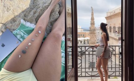
Megan’s example was almost nothing but photos, and that was the point. “These are just iPhone photos, super simple, easy to digest. We’re heading toward simplifying the info and making it relatable, like you’re talking to a friend over Snapchat.”
Maggie took it to the extreme end and loved it. “It’s stupid simple. I loved that they didn’t even use pictures, just words on a screen, kind of Facebook vibes.” Same idea, no photos at all, just a clear line and a short caption. The team kept arriving at the same place from different starts: strip it back until only the point is left.
Maggie brought one that broke the rules and worked anyway. It was a Zendaya post: one line of text, then nothing but photos. "It goes against what everyone says you should do. It was just one line, then the whole thing is pictures. Easy to replicate for different brands." Zendaya herself is scroll-stopping, her image and name alone earn the pause most brands have to design for, but the lesson Maggie pulled out wasn't the celebrity, it was the structure: one line, then let the images carry it.
Casey named the format: "Very editorial, like reading a magazine. You read the caption and flip the pages as you scroll." That's the feeling to aim for. The cover gives you the headline, and the rest is images you move through like pages. It even opens a practical idea for working with creators. Casey: "Ask influencers for a couple of photos and a video instead of a reel, and turn it into a carousel. It's like flipping a page of a book."
Simple is the default, not a rule to follow blindly. Emily pointed to where heavier formats still earn their place: “Beauty and hair brands still do photo-video carousels for texture, squeezing a lip gloss, lotion on skin, no text, just feeling.” When the product is the show, a short video clip beats a caption.
Mixed media also still lives on creator accounts more than brand accounts, so it can read as human when a real person is behind it. The test is the same every time: does the format make the post feel more human, or just more produced?
Brie brought the team back down to earth with the most practical points of the session. First, why simple is working: “People don’t have the attention span to read through something unless it’s highly valuable and relevant to something they’re dealing with.”
Then the one technical thing not to forget: “Make sure the cover image has the main keywords, so if they search it, it comes up.” Simple does not mean careless. The first slide still needs the words people would search for. And her workaround for genuinely information-heavy content: “Swap it for a static image or a B-roll reel with just the hook on screen, and put all the info in the caption.” People are used to reading the caption for the rest now.
Take the next carousel you're about to make and simplify it:
Being intentional matters more than following a rule. Some formats still call for heavier design, but most carousels don't need layers of graphics to make someone stop. When the idea is strong enough, sometimes the best thing you can do is get out of the way and let the content do the work.
Led by Emily Dunn, with Ailís Rinet and Megan Palyga. Featuring Maggie Renouf, Brie Heatherley and Casey Mathison.
Related Articles
.webp)
This guide is a step-by-step blueprint for consumer product brands looking to turn their happiest customers into powerful brand affiliates. By leveraging social media, brands can create a cost-effective, high-converting affiliate program that generates organic word-of-mouth marketing.